 Farbimpression, 10×17 cm, Pastell, 2010
© Astrid Volquardsen
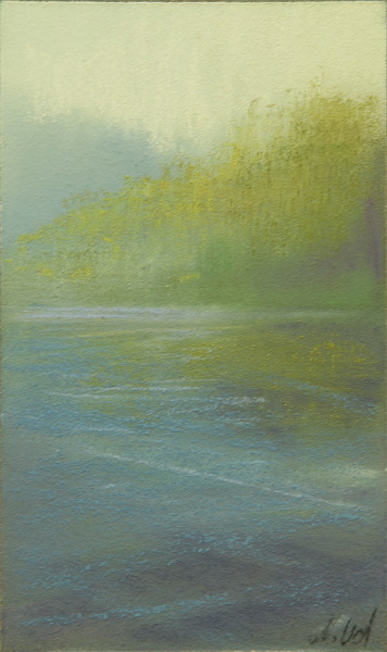
Another color impression. The more often I do it, the more I do enjoy it.

 Farbimpression, 10×17 cm, Pastell, 2010
Another color impression. The more often I do it, the more I do enjoy it.
Sonja
Hallo Astrid, Deine Farbimpression mit Grün ist wunderschön. Diese überträgt mit dem Blau im Vordergrund,und der Spiegelung in Grün, für mich unglaublich viel Ruhe. Ich glaube es kostet sehr viel Überwindung, sich so in die Farbe hineinfallen zu lassen. Ich kann es noch nicht.
Super, LG Sonja
Jala Pfaff
Oooo, how beautiful and soft and natural-looking! Was this with some of the new DT greens?
How do you feel about the grittiness of the DTs and their tendency to fill up LaCarte's tooth right away? These aspects bother me, though I find the colors quite luscious and rich.
Caroline
Hi Astrid, while I find your seascapes breath takingly beautiful I have to say your colour impression is stunning and my favourite so far. It looks as if a mist has come in while the sun is shining through on an area of a lake or coast with the forest in the distance.
loriann
Beautiful sensitive touch, like a delicately seasoned spring time soup.
Casey Klahn
Very striking, and sensitive, too.
Anonymous
Liebe Astrid,
wunderschön,diese Farben liebe ich.
Dein Kunst begeistert mich!! und ich bin sehr dankbar in deinem Kurs gewesen zu sein.LG Angela
loriann
Astrid, your use of greens and neutrals is quite splendid! I see that you are enjoying the new set of DTs.
Brian McGurgan
I love these Farbimpressionen, Astrid. This is a beautiful one with lovely color and texture.
sonja
Ups, nun war mein Kommentar weg- also nochmal,
Hallo Astrid, Diese Farbimpression gefällt mir unglaublich gut. Für mich gibt sie so viel Ausgeglichenheit und Ruhe wieder.
Es könnte ein kleiner stiller Waldsee sein, in dem sich das junge Grün der Bäume spiegelt. Ich muß es auch mal versuchen
Liebe Grüße Sonja
Cynthia
ahhhh this color…sooooo beautiful indeed!
Astrid Volquardsen
Hallo Sonja,
ich bin einfach ein Farbmensch und denke ehrlich gesagt nicht so viel darüber nach.
Hi Jala,
some of them are from the new colors. I find the terrages quite challenging, especially the grittiness. Something I have to get used to. But the colors are excellent.
Angela,
wie lieb von dir. Ich bin gespannt mal neue Sachen von dir zu sehen….
Hi Caroline and Casey,
thanks so much for your comments.
Loriann,
you know probably best that the neutrals seems to be the key.
Brian and Cynthia,
thanks for your comments. It's always nice to see that these little studies have something in them.