

Colourimpression: Birches
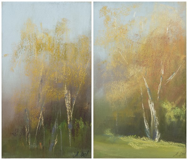 Studie, Pastell, je 10×17cm, 2010, © Astrid Volquardsen
Our new neighbourhood is surrounded by birches, so now I can easily observe how they change their color every day. I always believed they start right away with some light green. Well, they don‹t. I didn’t take any photos and as I stood there and looked at the colors to memorize them, I was really surprised to see these brownish, greenish, reddish…whatever colors.
As I again took a closer look today I was startled by the color of the sky. It usually isn’t that blue, something was somehow different. It obviously has to do with the flight restrictions over northern Europe, because of the vulcanic ash cloud from Icelands vulcano Eyjafjallajoekull (that’s a grand name, eh? I found a funny link about it’s pronounciation: Iceland Volcano spews consonants and vowels). All airports in Northern Europe have been closed for two days now, so no condensation trails can be seen in the sky.
 Foto, © Marc Volquardsen
 Blick von Ærø, Pastell, 8×24cm
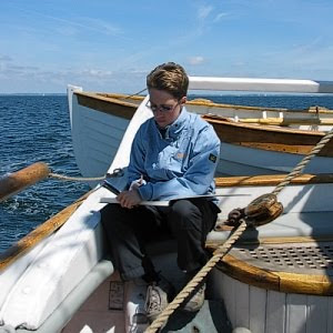 © Astrid Volquardsen
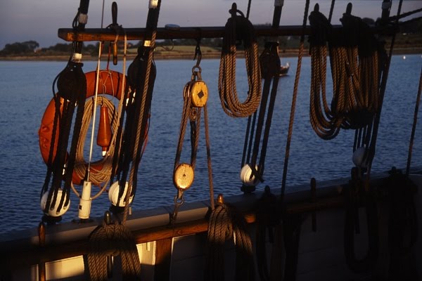
 2010 © Astrid Volquardsen
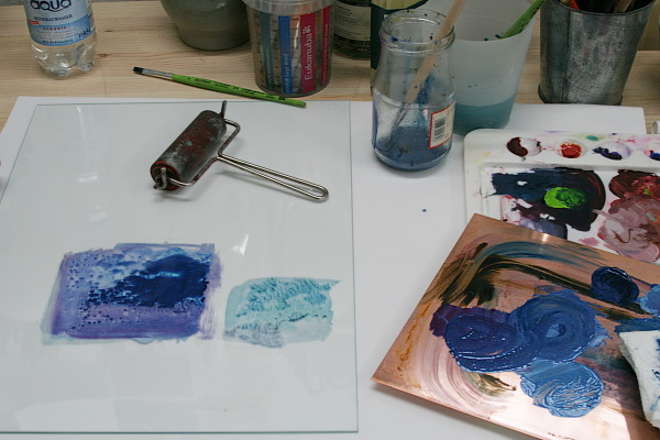
 The bottom right was done with the most amount of turpentine.
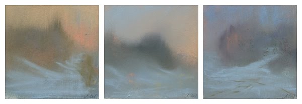 Winterfarbimpression, Pastel über Ölmonotypie, je 10×10cm,
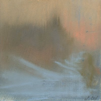 Winterfarbimpression I, 10×10cm,
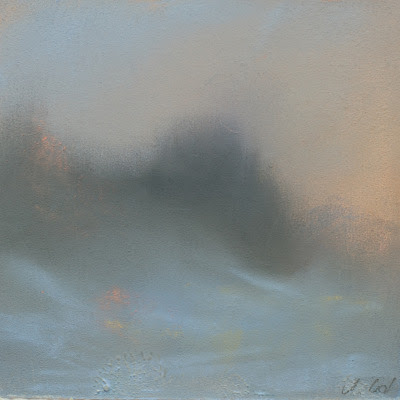 Winterfarbimpression II, 10×10cm,
 Winterfarbimpression III, 10×10cm,
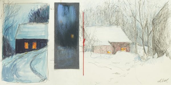 Skizzenbuch, Ink & Guache, Pastell, Ink & Buntstift
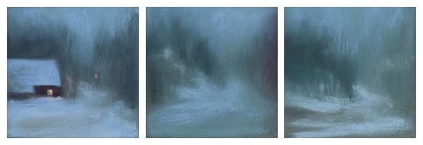 Winternachtbilder, Pastellstudie,12×12cm
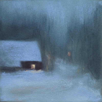 Winternachtbild I, Pastellstudie,12×12cm
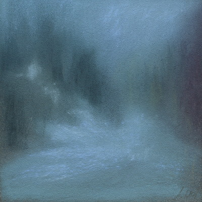 Winternachtbild II, Pastellstudie,12×12cm
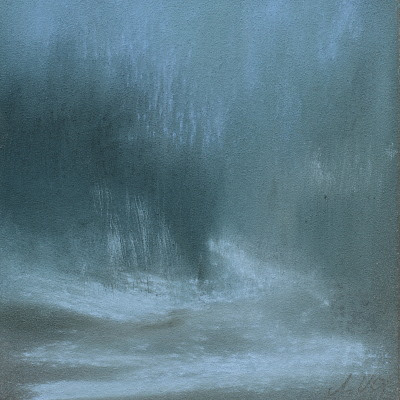 Winternachtbild III, Pastellstudie,12×12cm
 Winterfog, Pastel, 17×27cm