

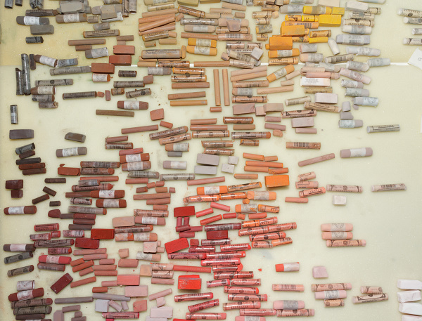
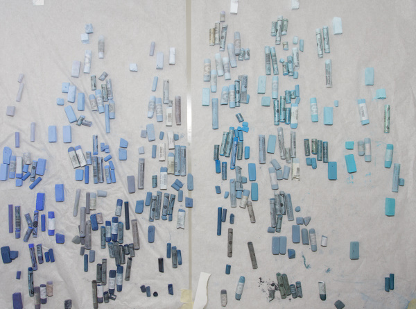
After approxomately 20 hours of work I have rearanged my palette and I am glad that I finally came around to do this. Sometimes it was very tirering but on the other hans I have discoverd many beautiful colors, of which I had now idea I do posses them.
© 2011, Astrid Volquardsen
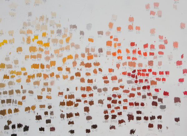
I sorted the pastels according to the color wheel. Each pastel I marked on a piece of white paper and noted down the brand and number so I might be able to find it more easily. If you put the sheets of paper next to each other you can clearly see how fascinating it is to the the color change within the wheel. How the reds evolve from yellow-red, to torange red, etc. Of great help was the Huechroval Color Chart. This is a color notation system of 24 different pastel brands based on hue, chroma and values. Unfortunately it is no longer available.
© 2011, Astrid Volquardsen
Doing this has increased my understanding of color a lot and now I am able to visualise more easily the color within the color wheel. Along the process I had some litte surprises, like finding out that some light blues are actually more like light green. Somehow I never saw the green nuance in it.
© 2011, Astrid Volquardsen
Even though I had the Colorchart for orientation I realised how difficult it is to find an arrangement for the pastels. The color wheel is best seen as a three dimensional system, based on hue, chroma and value. So how does one arrange this in two dimensions on a flat table?
My dad build some nice long boxes for me and after I have put my pastels in those, there will be another step: Then I need to find my favorites sticks in a completely new place.
Karin
Hallo Astrid!
Das ist richtig interessant und inspirierend.
Sag mal, kannst Du mal diese Holzkästen, die Dein Vater gebaut hat, zeigen? Die würden mich sehr interessieren.
Viele Grüße, Karin
Astrid
Hallo Karin,
ich werde nochmal etwas über die Boxen reinstellen.
elke t.
Schon die Fotos von den sortierten Kreiden sind echte Kunstwerke…
Ich habe viel Freude beim Betrachten Ihres Webauftrittes, vielen Dank dafür!
Astrid
Hallo Elke,
ja, da merkt man doch die Kraft von Pigmenten.
Casey Klahn
Your dad did a fine job on the boxes.
So, I am wondering if the grayed hues are to the sides of each box, and the higher chroma in the middle? You have done something here that I have never seen before – an open layout.
Astrid
Hi Casey,
I want to try the open layout, because that fits to my personality. To catch everythink with one look. Sometimes my wall is pinned with notes of all my ideas and sketches. This way I get a better picture of it.
The grayed hues I let stay within the arrangement but in small groups. So sometimes it’s in the middle or on the side of the box. It depends on the colorwheel. But I didn’t always keep the values straight but put the preference on the color.
Well, today I will start painting again and I am very curious how this all will work out.
Casey Klahn
I look forward to seeing the paintings. Get your talented husband to take a fish eye or panoramic view of your studio set-up with the new palette, please.
May I post about this at pastelsblog?
Astrid
Hi Casey,
he will see to it….:-)
Of course you may post about this.