

Gouache
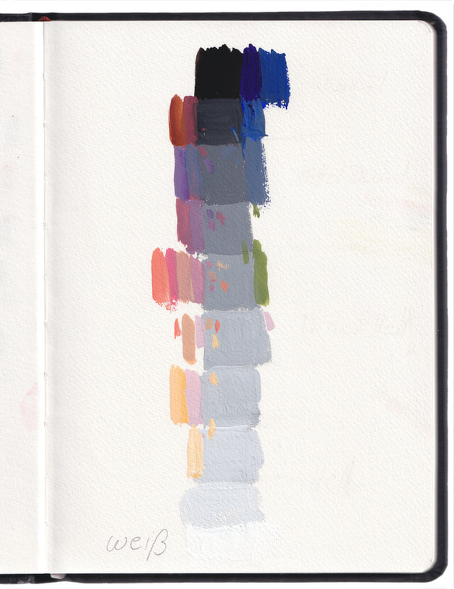
In my simplified tonal value scale I mix the grey values and place them from top to bottom. Black is the starting point and I mix in more and more white. Now I compare which of the mixed colours correspond to the respective tonal value. The trick is that when I pinch my eyes together, everything blurs to one tonal value. (Note: I do not use black to darken the colors)
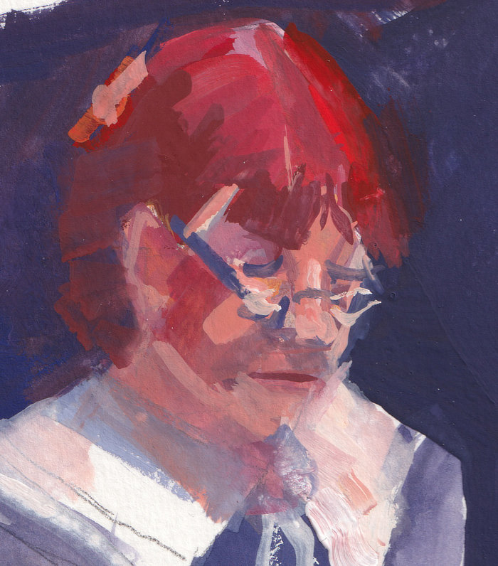
Detail: The Reader
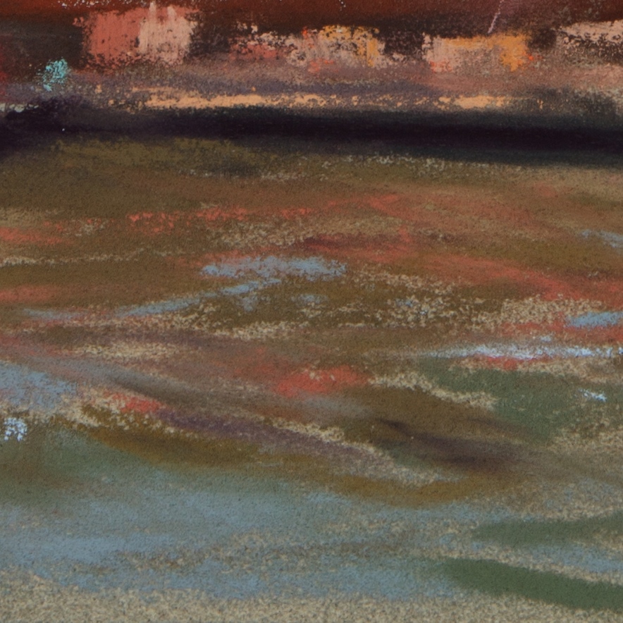
Detail: Pastel picture
The whole principle also works with pastel, without having to use black for darkening. That depends on the manufacturer. Very dark colours are offered by Sennlier, Unison and Terry Ludwig, for example.
Monika Hofmann
Liebe Astrid, es tut immer wieder gut von dir etwas lesen und sehen zu können. Danke.
Astrid
Gut Ding braucht Weil.
Kalle Zangerl
Danke Astrid
Kreativ und vorbildlich wie immer
Gruss Kalle
Svenja
Ach, was ist ds schön wieder regelmäßige Blogbeiträge von dir zu lesen :)!!
Lieber Gruß,
Svenja
Astrid
So langsam gewinne ich immer mehr meine Form wieder zurück. Sprich: Koordination, Konzentration, Kraft in Arm und Bein.
Brigitte Renner
Liebe Astrid, ich bin schon einige Zeit Eine stille Bewunderin Deiner Arbeit.
Und möchte Dir gerne Mut zusprechen, die langsamen Genesungsschritte zu „ertragen“.
Ich habe mich sehr gefreut, wieder ein Lebenszeichen von Dir zu vernehmen. Weiter so!
Auch dies ist ein Weiterer Schritt zur Heilung.
Ganz herzlichen Gruß von Brigitte