

Sketchbook, Astrid Volquardsen, 2020
A large wide field are color mixtures from different manufacturers. There is no wrong and right here.
There is one exception that I would like to make: Here, too, it depends on the pigment quality. There is no cheap pigment for .-99 Euro for a 100 mm tube. Full of fillers that just beat on the quality. There is simply not and my experience in pastel and oil painting confirm this. Less is more. To the statement that it is only a matter of trying out, my reply comes: »What if it is the technique with which you feel most comfortable, you would make the most progress, but you fail because of the pigments?« That would be a real shame and a wasted opportunity.
The paper quality is written on a completely different page, ( here you should pay attention to acid-free quality), but it really depends on what effect you want to achieve and especially what you feel comfortable with.
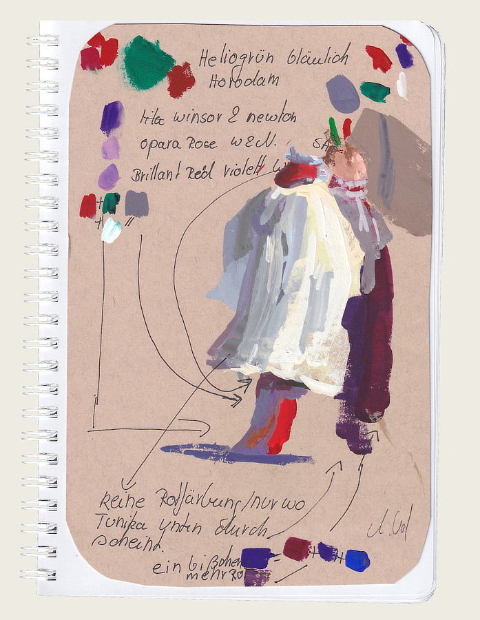
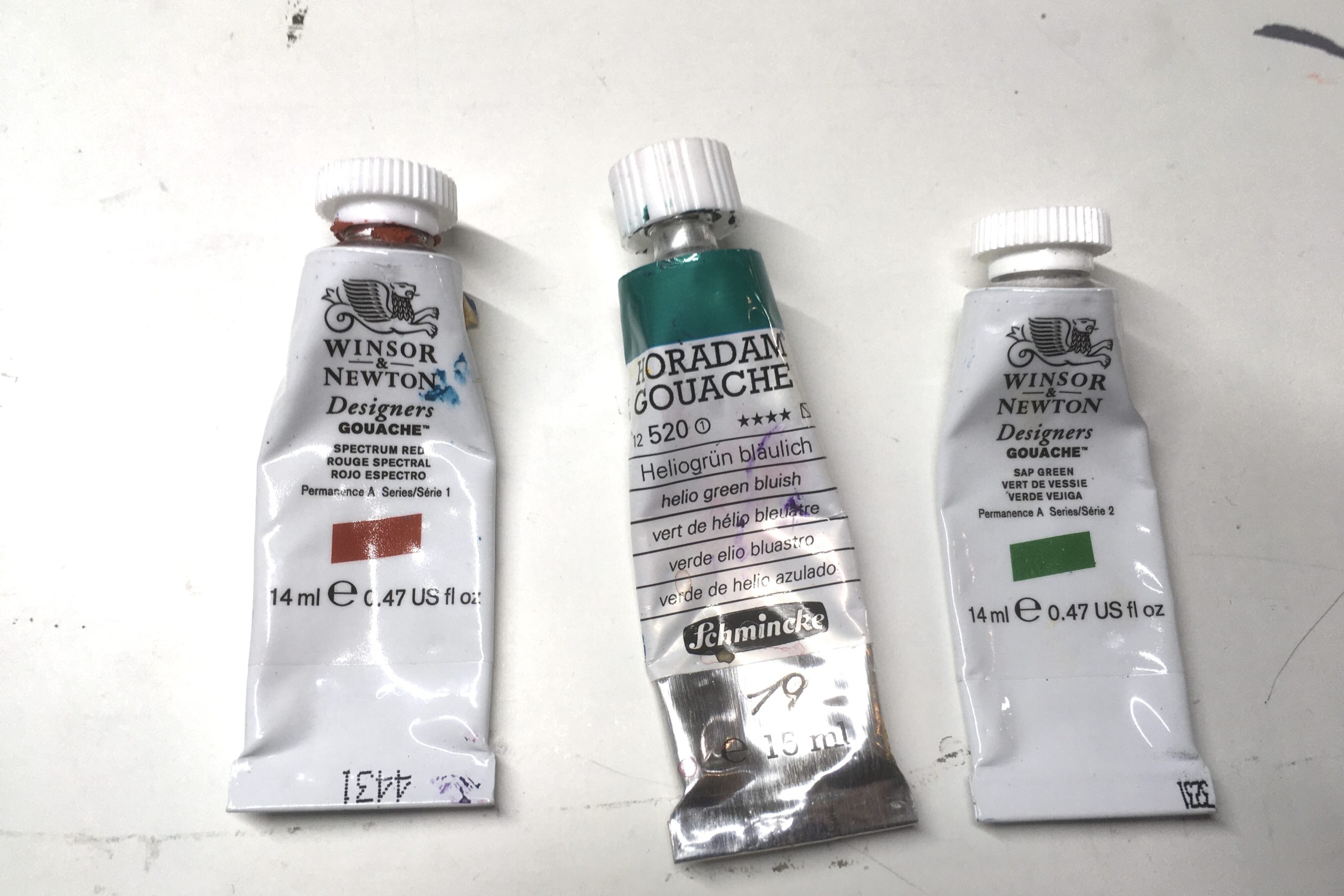
I always do preliminary studies on the main colors on the appropriate papers I use. My new discoveries are HelioGreen (Horadam) and SAP Green.(Winsor&Newton)
Claudia Langer
Liebe Astrid,
freue mich von dir zu lesen;)
Das du jetzt die Farbmischungen erläuterst finde ich super! Mir ist es nämlich schon so manches mal passiert, dass der gemischte Farbton jegliche Leuchtkraft verloren hat und irgendwie«schmutzig« wirkte!
Damit kann man sich ein ganzes Bilder kaputt machen!
LG Claudia