Bright nights
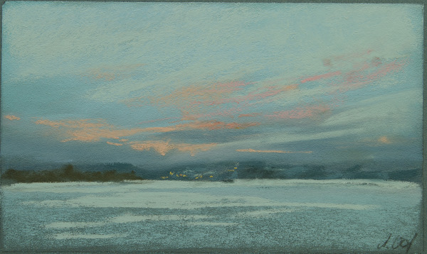
Bright nights, 12×20cm,
© Astrid Volquardsen, 2011
This summer we went to Denmark at the Flensburg Fjord just across the German border. I forgot how bright nights can be up here. I did this pastel painting plein air after 10 p.m.


Bright nights, 12×20cm,
© Astrid Volquardsen, 2011
This summer we went to Denmark at the Flensburg Fjord just across the German border. I forgot how bright nights can be up here. I did this pastel painting plein air after 10 p.m.
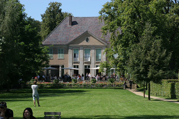
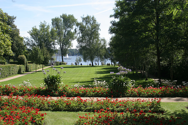
The Berlin painter Max Liebermann (1847-1935) is known to be one of the painters who brought the impressionistic painting style to Germany. In his last years he had built a summer house on the Wannsee lake in Berlin. There he painted over 400 oil paintings and pastel sketches making the garden to his main theme in his late work.
© Astrid Volquardsen, 2011
In 2004 we had a really good exhibition in my hometown Hamburg just about these paintings and his garden which was designed to his ideas. He had done some great paintings of a birch alley, which I fell in love with.
© Astrid Volquardsen, 2011
In the year of 2006 the house and garden could be opened to the public. Till then the Liebemann villa was leased to a diving club and only after massive protest it was made possible to turn it into a Museum and reconstruct the house and garden.
© Astrid Volquardsen, 2011
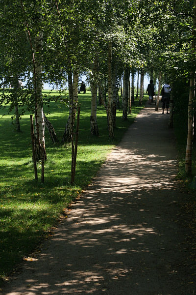
Finally I have made it to this most beautiful ensemble and did spent there entirely six hours. When they did the reconstruction of the garden they also planted a new birch alley along the path and when I saw it I instantly knew what must have catched Liebermanns‹ eye.
I sat down there and tried to do some sketching but unfortunately some (more) mosquitoes were biting really bad. I wondered if Liebermann did have the same problems?
© Astrid Volquardsen, 2011
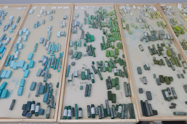
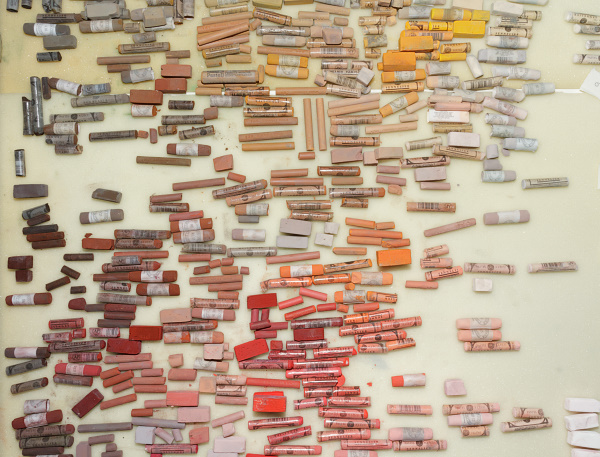
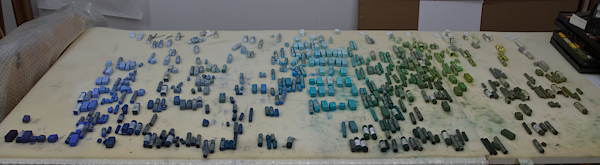
To store my pastels I decided to build some long boxes without any space holders. This way it is much easier to follow the color wheel. Further more some colors take more space and others less, so I can be much more flexible arranging them.
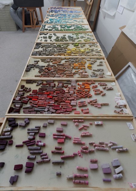
© Astrid Volquardsen, 2011
After approxomately 20 hours of work I have rearanged my palette and I am glad that I finally came around to do this. Sometimes it was very tirering but on the other hans I have discoverd many beautiful colors, of which I had now idea I do posses them.
© 2011, Astrid Volquardsen
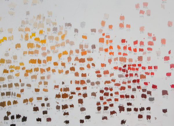
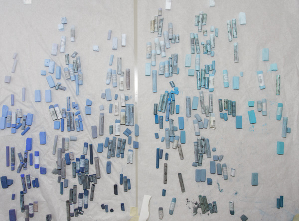
I sorted the pastels according to the color wheel. Each pastel I marked on a piece of white paper and noted down the brand and number so I might be able to find it more easily. If you put the sheets of paper next to each other you can clearly see how fascinating it is to the the color change within the wheel. How the reds evolve from yellow-red, to torange red, etc. Of great help was the Huechroval Color Chart. This is a color notation system of 24 different pastel brands based on hue, chroma and values. Unfortunately it is no longer available.
© 2011, Astrid Volquardsen
Doing this has increased my understanding of color a lot and now I am able to visualise more easily the color within the color wheel. Along the process I had some litte surprises, like finding out that some light blues are actually more like light green. Somehow I never saw the green nuance in it.
© 2011, Astrid Volquardsen
Even though I had the Colorchart for orientation I realised how difficult it is to find an arrangement for the pastels. The color wheel is best seen as a three dimensional system, based on hue, chroma and value. So how does one arrange this in two dimensions on a flat table?
My dad build some nice long boxes for me and after I have put my pastels in those, there will be another step: Then I need to find my favorites sticks in a completely new place.
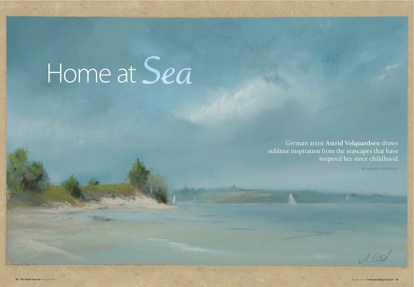
The August issue of the Pastel Journal is available from the Pastel Journal website as download version for 6,99 Dollar.
© Astrid Volquardsen
I returned from my trip to the Baltic sea and my sketchbook and head are full of new paintings and ideas. But before I can go back to the easel and start painting I need to rearrange my complete pastel set. The old arrangement didn’t work any longer and I have started to do it properly (which is a lot of work, believe me). My new setup is based again on value, but this time I keep close to the color wheel and I don’t keep the different brands apart. This way I will be able to find much more easily the colors needed.
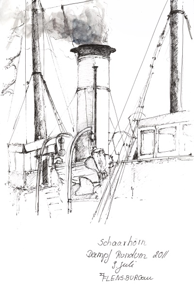 Dampf Rundum – Steamboat Schaarhörn, Sketchbook, 2011
At the beginning of July, the small town Flensborg (at the Danish border) was hosting a couple of old beautiful steam boats. While waiting to go on one of them for a round tour on the fjord, I had some time to do a nice sketch. Sketching opens to me a new world and makes me somehow more engaged in my surroundings. I love these sektching times, because it slowes me down in this speedy world.